
Dual Axis Measure Swap Part 2
Last week we built the initial framework for a Dual Axis Measure Swap chart that can be used to provide user selectable dual axis charts. One of the reasons we implemented these at work was to provide dashboard users the ability to choose if they wanted a line or a bar chart visual.
From a development standpoint, it may seem easy enough to just create both a bar chart on one sheet and a line chart on another sheet and let the user select which one they want to use. While this is a simple task in less complicated workbooks, when you are developing something that needs to be able to produce thousands or even millions of different dimension/measure/filter combinations, it becomes anything but trivial. A task like adding a new dimension can become exponentially tedious if you have a single sheet for each chart. As part of our teams dashboard architecture, we try to limit the number of what I would call “single use charts” and create a framework that allows the end user to create whatever chart they might need using parameterized dimensions/measures/filters.
As part of that architecture and to expand on what we have previously built, we are going to add in a new option to both the bar and line measure parameters so that users can now choose between a bar chart, line chart, or dual axis chart.

Step 1 is very simple, and really the only step aside from some formatting. Add a “None” option to your existing p_bar_measure and p_line_measure parameters. In this case, there is no need to modify either of the calculated fields since we used case statements and only declared cases for values of 1 and 2. Any other value will cause the measure to return null by default.


Step 2 involves removing the zero line to create a more visually appealing chart when either bar or line are set to None. Right click on the chart and select the Format option. This will bring up the Format options where the Dimensions and Measures lists would normally be. Select the Lines option to bring up the corresponding format options, and set the Zero Lines to None.


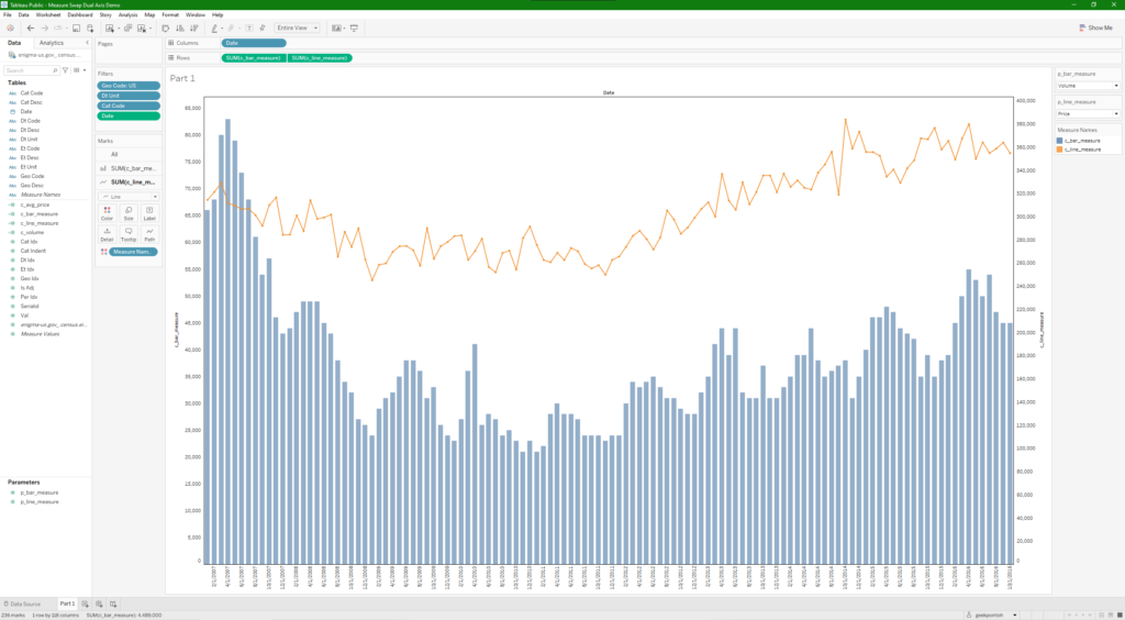
Once that is done, you can set your bar measure and line measure parameters to None to create only a bar chart as shown in the image at the beginning of the post, or only a line chart as show below, or leave both on to use as a dual axis chart.