
Dual Axis Measure Swap Part 1
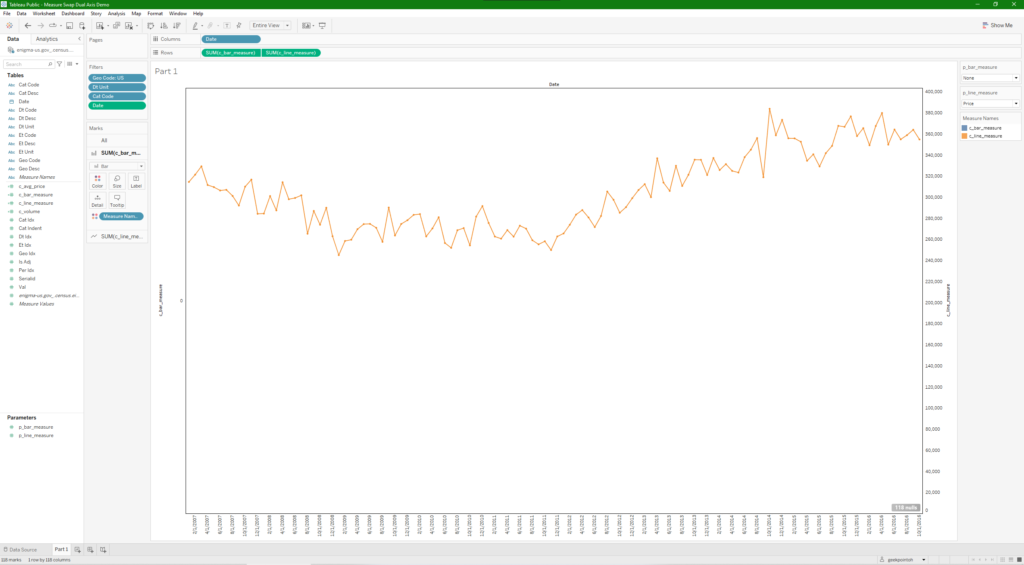
I wanted to share some architecture we recently launched into most of our production dashboards at work. I’m going to break this up into a few parts that build on top of each other to end up with a very versatile self-serve chart. For part 1, we’ll start by parameterizing both measures of a dual axis chart. This will allow users to select which measure they want to use for both axis 1 and 2, which in this example are a bar chart and line chart respectively.
Step 1 requires the creation of two parameters to allow the user selections.


Step 2 is the creation of two calculated fields to select the measure identified by the parameter value.


Step 3 is building the view. Go ahead and place your date field on the Columns shelf and any necessary filters on the Filters shelf. Place the c_bar_measure calculated field on the Rows shelf, followed by c_line_measure. Set c_bar_measure to Bar (I like to set it at 60% opacity so that the lines can still be seen over them), and c_line_measure to Line via the Marks shelf. You should end up with something similar to this.

Step 4 is switching the view to the dual axis. Simply right click on the line measure axis and select the Dual Axis option. This place the bar and line chart on the same row and will add a secondary axis on the right side of the chart. You can right click on that secondary axis to select the Move marks to front option if the line chart is not on top of the bar chart.


Once that is done, you can add you parameters to the sheet and your view should look something like this. In the image below, I have swapped the bar and line measures using the parameters to produce a different chart than the one at the beginning of the post. This example only has two measures to select between, but in future posts, we’ll add more measures and allow for some color dimensionality as well.